By Cassie Costner, Website Project Manager, Oozle Media
Spending marketing dollars on pay per click (PPC) ads can be an effective way to bring in low-hanging fruit. However, if the website or landing page isn’t built in a way that encourages visitors to convert, money spent on PPC, or any other method to bring traffic to your website, is wasted. While conversions may still happen on a poorly constructed website, they will be minimal compared to what they could be if the website was set up to convert.
Before spending another dollar on any type of ad, take time to assess the website and the target demographic. Make the most of every click by optimizing the website for conversions before sending traffic by following these simple steps.
Before reading these steps, you need to have the right mindset: it’s time to accept the idea that the website will never be done.
A website is never perfect. By the time the latest and greatest version is up and running, best practices have already changed. Users don’t take long to get used to conversion tactics and learn to block them out as more websites employ them. By continually learning from users through surveys, website analysis, and other feedback, improvements can be made to give website visitors more useful information and a clear way to convert, increasing leads.
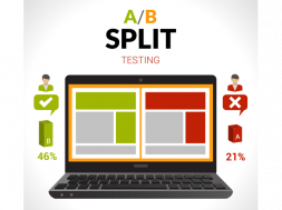
While A/B testing, running two versions of the same web page with variations and determining which one will convert higher, is the most effective way to improve your website, it is an investment of time and money. Before engaging in A/B tests, examine current best practices and the website. The steps below are changes that should be made immediately to the website to better optimize and make the most of ad dollars.
 Mobile first
It’s no secret that people are doing the majority of searches through their phone. Google announced that on April 21, 2015, websites that were not mobile friendly would be penalized by the algorithm (Google 2015). Now three years later, if a website hasn’t been penalized by this, it’s only a matter of time. Websites that aren’t mobile friendly in 2018 are missing out on huge opportunities in the search engines. This means, all other factors being equal, a website with a good user experience on mobile would outrank one that had a poor mobile experience.
Today it’s not only important to have a mobile site the search engines approve of, it’s also important that website visitors have a positive experience on mobile. There are a few different factors that lead to a good mobile experience including:
- Load time – Does your site take more than five seconds to load? If so, you’ve got a problem. Most visitors expect a mobile site to load within a few seconds. As load time increases, so does the chance visitors will bounce from the page to find another option. A survey of users found that even a one second delay in load time could reduce conversions by 7 percent (Neil Patel 2018). Speed is essential for both desktop and mobile visitors. A slow website could be a result of poor hosting, unnecessarily large images, too many requests, or bad server configuration. Using tools provided by companies such as Pingdom (Pingdom Tools) or Google (Google Pagespeed Insights) can help determine what is causing a website to load slowly and what steps need to be taken to fix the issue.
- Text readability – If the mobile site’s text is too small, users will not take the time to consume the information. Text on mobile should be large enough for visitors to read without having to zoom in on the screen. Just as important, that text should be against a background that makes it easy to read. Black text against a dark blue background will lead to a poor user experience, especially on the phone.
- Main navigation – The hamburger button has become a popular indicator on mobile sites for the main navigation. This makes it so even sites with large navigations are clean and easy to use on mobile.
- Mobile responsive – There’s a big difference between the screen of the smallest smartphone to an iPad, with all sizes in between. To have a truly good mobile experience for all users on any device, it’s essential to have not just a mobile site, but a mobile responsive site. This means the site will adjust to fit the size of the screen rather than just having two sites for mobile or desktop.
If a website’s mobile experience does not follow these mobile friendly guidelines, it risks losing leads. While it’s pointless to wait for the perfect website before sending traffic, resolving these issues first will have a great impact on conversion rates.
 Content specific to the right audience
Content includes any text, images, or videos on the website. Putting the right content formatted in the right way is essential for a website’s conversion success. Content, much like the rest of the website, will never be complete. With the help of user research, it should be updated on a regular basis to ensure it is accurate, speaks to the correct target audience, and gives useful information users are looking for. Business owners can have the best content for their audience by:
- Having a hand in writing or editing the content. Nobody knows the business better than the business owner and those who are involved in the day to day of the business. While professional marketing companies may be able to produce well written content with marketing in mind, those who actually spend time with the business should have some impact on the writing. A marketing company will never get the tone and voice just right; it’s essential that the two sides work together to produce the best possible content.
- Feedback from current customers. For a school, surveying current students can be useful in learning to better market to potential students. Why students chose the school, what information they felt was missing from the site, and why they felt like the school was a good fit for them are all great questions to ask. Compile these answers, find patterns, and cater content to meet these needs. There will be outliers, which is why it’s critical to survey a large pool of students before making decisions.
- Structure content in a way that is easy for users to consume. With much of the world’s knowledge at our fingertips at all times, users have gotten used to getting information and being able to consume it quickly. Landing on a page with large paragraphs of text without anything to break it up will increase the motivation for users to bounce for an easier solution. Text should be easy to understand and broken up by small paragraphs, images, bullet points, and headings. Web style guide (Lynch & Horton) also recommends that paragraph lines are no more than 12 words long online.
- Content that is obvious. If a user does not see the content they expect on a website, they are more likely to bounce (Crazy Egg 2018). Sending a user to a cosmetology landing page that says “Your future can start here” will be weaker than one that specifically says “Your future in cosmetology can start here.”
The right content is one of the most critical pieces of a website. Strategically writing content that accurately represents the business and takes into account user feedback will lead to more successful content in the long run.
 Clear calls to action
Users will leave a website if they don’t know what they are supposed to do (Crazy Egg 2018). It’s a tough balance between giving users all the information they need to convert while cutting out the noise to give a clear path to conversion. The simpler the page while still getting all necessary information across the better.
It’s easy to get used to your own website structure and mistakenly feel the calls to action are obvious. There are a surprising number of websites that don’t even have a form or don’t have one in an obvious place on the site. Ensure that the form or a button that clearly leads to a form is easy to find and fill out from the homepage of the site. Reducing friction before the conversion, whether that’s a form out or a phone call will increase conversions.
Identify the primary action for visitors on a page, then create a clear path for visitors to take that action. For beauty schools, most of the time the most important call to action will be either scheduling a tour or applying to the school. While other secondary calls to action such as reading the blog and salon appointment requests are necessary, it is important that on critical pages for conversion (such as the homepage and program pages) these do not conflict with the primary call to action.
While it may feel uncomfortable at first, calls to action on the site need to stick out and look awkward.
If it disrupts the website and draws the attention of users, it’s doing its job. The more a call to action blends in with the rest of the site, the fewer conversions can be expected.
Not only is it important that calls to action are clearly visible, but that they are placed correctly on the page. There are arguments on both sides as to whether or not the fold, which is the portion of the website appearing before scrolling, still exists. Regardless, when long pages are being used, placing a strong call to action above what is thought of as the fold and lower on the page can help increase conversions.
 Balance creativity and simplicity
Design trends come and go. Some are more successful at converting than others. While creativity is important, conversions are more important. A beautiful complex design can be distracting for visitors, leading to fewer conversions overall. There are many places where creativity is necessary in website design, but it is important to focus first on ease of use for visitors. Finding the right balance between perceived beauty and simplicity will help cut the clutter and lead to more conversions.
It isn’t just the main structure of the design that should be simplified, but the content and calls to action as well. As Has Hofmann said, “the ability to simplify means to eliminate the unnecessary so that the necessary may speak.” By eliminating unnecessary clutter and confusion from a website, the primary goals of the website will be given a stronger voice.
Creativity is still important, especially in visually focused industries.
Simple, straightforward websites with no creativity or beauty will not convert or engage visitors, even if they follow every other optimization suggestion. A website can be creative and effectively get the point across.
Striking the right balance between the two will lead to a more successful website.
Spending more money on ads will never be enough if the website isn’t built to convert. Before spending another dollar on ads, assess the website to ensure it’s effective at converting visitors. With that being said, don’t forget that waiting for the website to be perfect before running ads is a foolish goal. The website will never be done, and that’s okay. After making initial optimizations to a site, continue improving and learning from the site as ads are running. The process of continual improvement will help ensure the best possible website at the time and prevent outdated and ineffective conversion tactics on the site.
References
“Finding More Mobile-Friendly Search Results.” Official Google Webmaster Central Blog, Google, 26 Feb. 2015, webmasters.googleblog.com/2015/02/finding-more-mobile-friendly-search.html
“How Loading Time Affects Your Bottom Line.” Neil Patel, Neil Patel, 25 June 2018, neilpatel.com/blog/loading-time/?wide=1
Lynch, Patrick J., and Sarah Horton. “Web Style Guide, Third Edition.” Page Structure | Web Style Guide 3, Sarah Horton, Patrick Lynch, webstyleguide.com/
“PageSpeed Insights.” Google, Google, developers.google.com/speed/pagespeed/insights/
“Pingdom Tools.” Website Speed Test, tools.pingdom.com/
“Report: Nearly 60 Percent of Searches Now from Mobile Devices.” Search Engine Land, Search Engine Land, 8 Aug. 2016, searchengineland.com/report-nearly-60-percent-searches-now-mobile-devices-255025
“The 59 Second Rule: 3 Reasons Why Users Leave a Website.” The Daily Egg, 20 Apr. 2018, www.crazyegg.com/blog/why-users-leave-a-website/
CASSIE COSTNER is the website project manager and conversion rate optimization manager at Oozle Media. For more than five years she has worked with small to medium sized businesses on writing their content and designing websites to convert more visitors into leads. Cassie graduated from the University of Utah.
Contact Information: Cassie Costner // Website Project Manager // Oozle Media // 801-562-8557 // https://www.oozlemedia.com/ // http://www.facebook.com/oozlemedia // https://www.instagram.com/oozle_media/?hl=en // https://plus.google.com/+OozleMediaSandy/about // https://www.linkedin.com/company/oozle-media


